If you want the best design, ask strangers to help
Editor’s Note: Jutta Treviranus is a leader in inclusive design; she started and directs OCAD University’s Inclusive Design Research Centre, heads the Inclusive Design Institute and founded the first inclusive design graduate program at OCAD U. In this post, Jutta explains the costs and impacts on the edge and the unrepresented when identity clustering and cookie cutter approaches to digital inclusion occur.
Last spring Hillary Hartley joined the Ontario Government as the first Chief Digital Officer, assigned to design, develop and deploy a friendly, efficient, effective, accessible, inclusive and participatory online government. A tall order, even for someone that has experience wrangling the US administration.
There is also a commitment that the government will act as a model of good practice for other organizations in Ontario, and a leader globally.
Where do you start?
It’s not an exaggeration to say that the Ontario Government is a very complex system. The Ontario Public Service has more than 60,000 employees. There are 30 ministries with well-established divisions of power and well worn-in routines (the Ontario Ministry of Transportation, for example, just celebrated its 100th anniversary). There are nine independent “Information and Information Technology” clusters. As with any large and well-established bureaucracy, the documented rules and policies would take years to read, and this does not account for the unwritten conventions and implicit customs that guide behaviours and habits within an institution. Add to this the Legislative Assembly, the political arm of the government, which serves for fixed terms and needs to deliver on its commitments to garner re-election. And most importantly, the complex relationship with a very diverse public with a huge variety of expectations and opinions regarding good government.
This bold experiment in institutional change is indeed a model to watch. Given this hugely complex and challenging task, where do you start?
The 80/20 Principle?
One of the conventions and pieces of advice often given to individuals attempting an overwhelming task with limited time and resources is the “80/20 rule.” There are many interpretations of this rule, but the crux of the advice is to tackle the 80% first, which will theoretically require 20% of the effort, and leave the most difficult 20% for later. This is based on the Pareto principle or the “law of the vital few.” In 1896 Pareto showed that 80% of the land in Italy was owned by 20% of the population. Richard Koch popularized the principle in business through his 1998 book “The 80/20 Principle,” and this principle has been extrapolated to everything from sports to health and safety; as well as to developing new programs in government.
Indeed, I overheard someone reference this principle to Hillary at a digital government conference this past year. I would say that we face a different, more complex and more entangled reality than in Pareto’s day, and following his principle will never produce the change we need. I contend that we should do the opposite. Let me explain.
Unlearning and the “difficult” 20%
As a professor, the most difficult and advanced graduate course I teach is called “Unlearning and Questioning.” The students that struggle the most in this course are almost invariably the ones that have been highly successful, with the top academic records, who have been dubbed our “best and brightest.” In contrast, previously struggling students often shine. By the end of the course all the participants report that they have changed each other in profound ways.
You might ask why I would create and teach a course that seems the antithesis to education. Isn’t a university education about learning, not unlearning? Also, what led me to recruit struggling students into an advanced course?
The very simple answer to the first question is: because the world is changing. All students face exponentially increasing complexity and discontinuities in every realm of their lives. We need new tools, and a far larger and diverse set of tool choices, to participate and intervene. What gets in our way in coming up with and adopting these growing and evolving tool sets is the over-application of what we are good at, focusing on the things we can do with confidence, and the assumptions to which we are most attached.
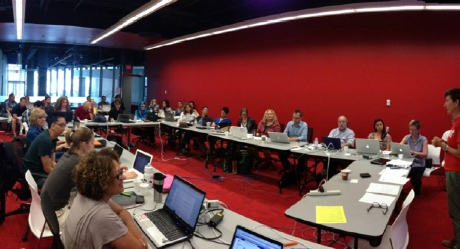
Figure 1: Inclusive Design Class called “Unlearning and Questioning
Key skills needed to participate productively in this change include many things we have devalued (if not demonized) in education, either explicitly or implicitly. These underdeveloped and much-needed skills include: valuing failure and mistakes, maintaining humility and vulnerability, collaboration, providing and seeking constructive critique, the courage to challenge authority, welcoming dissonance, integrating diverse perspectives, reserving judgement, focusing on process not product, and looking for the right questions rather than rushing to answers. We need to make room for and become receptive to these and other new competencies. Like the chemical receptors in our brain that are blocked from binding in new ways, I try to decouple my educated students from their strongly held bonds to presumptions and assumptions that block new considerations and processes.
Regarding the second question, why recruit students that have struggled? It is because I want to prepare students to take on the hugely complex and difficult challenges facing our society. I want to create a learning community that can respond to our global risks and effect inclusive change. To achieve anything complex requires radical diversity, for what Scott Page calls the “diversity bonus.” Complex problems require diverse perspectives. The more diverse the better. In the face of adversity and exclusion, these students have honed resourcefulness.
Planning to intervene in change requires prediction. With accelerated change, it has become much more difficult to predict what might happen. It is a fact that the overall group prediction error is reduced in relation to the diversity of the group. Put another way, for more accurate prediction you need as much diversity as you can get.
Representing Diversity
Diversity and inclusion have become trending topics over this past year. The terms are used so casually of late that they have almost lost their meaning. Although we often glibly state our commitment to diversity, in reality, most of the tools and practices we currently hold dear are in opposition to diversity. This means there is a great deal to unlearn to realistically achieve inclusive change. This includes the 80/20 rule.
The 80/20 rule is apt if you want to serve the status quo. Another way of thinking about this is to consider a scatter-plot of the needs of any group of people.
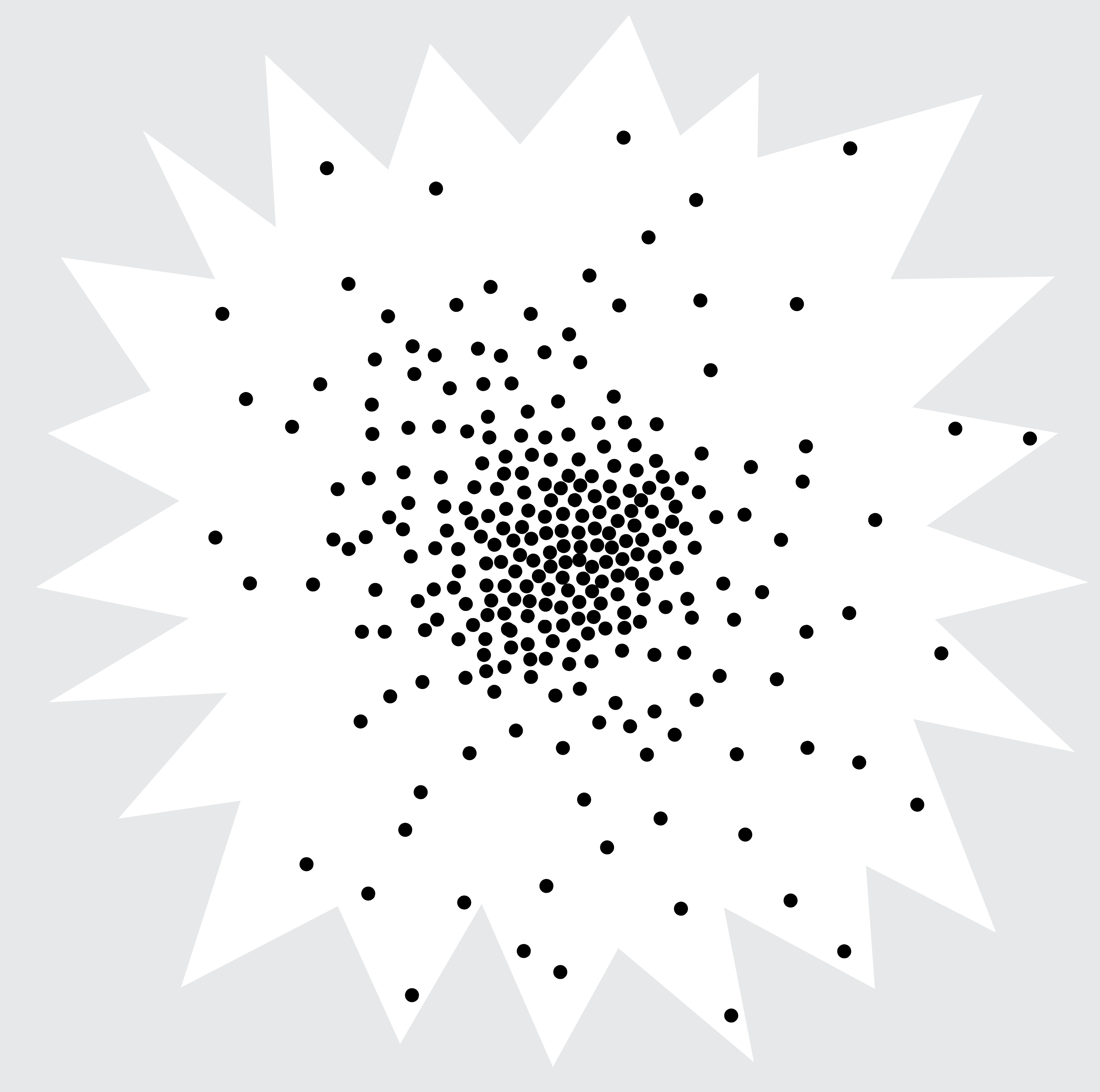
Figure 2: A scatterplot of needs of any given population, the distribution is like an exploding star.
It will look like an exploding star with a denser set of dots (representing the majority needs) in the centre, and more widely spaced dots the further you get from that centre (the minority needs). Distance represents difference. The closer the dots the more similar they are. The wider they are spaced from each other the more they differ. If you want a design that will cover 80% of the dots (or needs), you only need to cover 20% of the space, or that central cluster. This centre is also where you can achieve economies of scale, because needs are very similar. This sounds very reasonable and efficient. It served industrial markets and mass production well. It allowed for quick wins. However, it comes with some major costs.
The Costs
Change and innovation are found out at the edge, not in the centre where mediocrity lies. If you are serving a complex system in flux, even that central 80% covering 20% of space will inevitably move and your design won’t have the coverage. Your design will be what we call “brittle.” You will need to respond to more and more exceptions and issues you did not consider. Your design will start to look like a house with bolted on additions, which inevitably will cause the whole structure to collapse. End of life will be sooner. Costs will be greater in the long term.
Our government needs to be here for the duration. If you plan to include the edge from the beginning, your design might take more time and resources at first, but it will be dynamically resilient and adaptable. It will be future friendly in that it will give the centre a great deal of room to shift. It will also cost less in the long term.
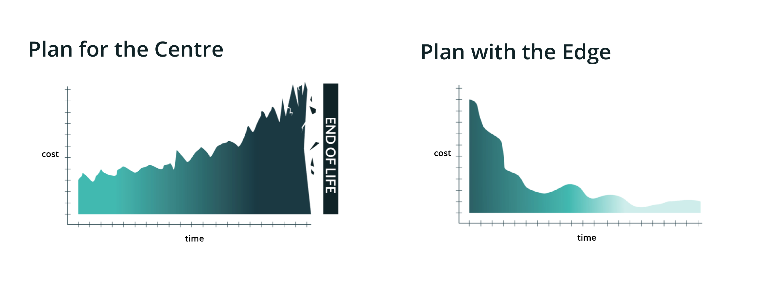
Figure 3: These two groups show the costs over time for when planning for the centre (where costs increase over time) and planning with the edge (where costs decrease over time).
Designing with the Edge
My advice would be to design with the difficult 20% first.
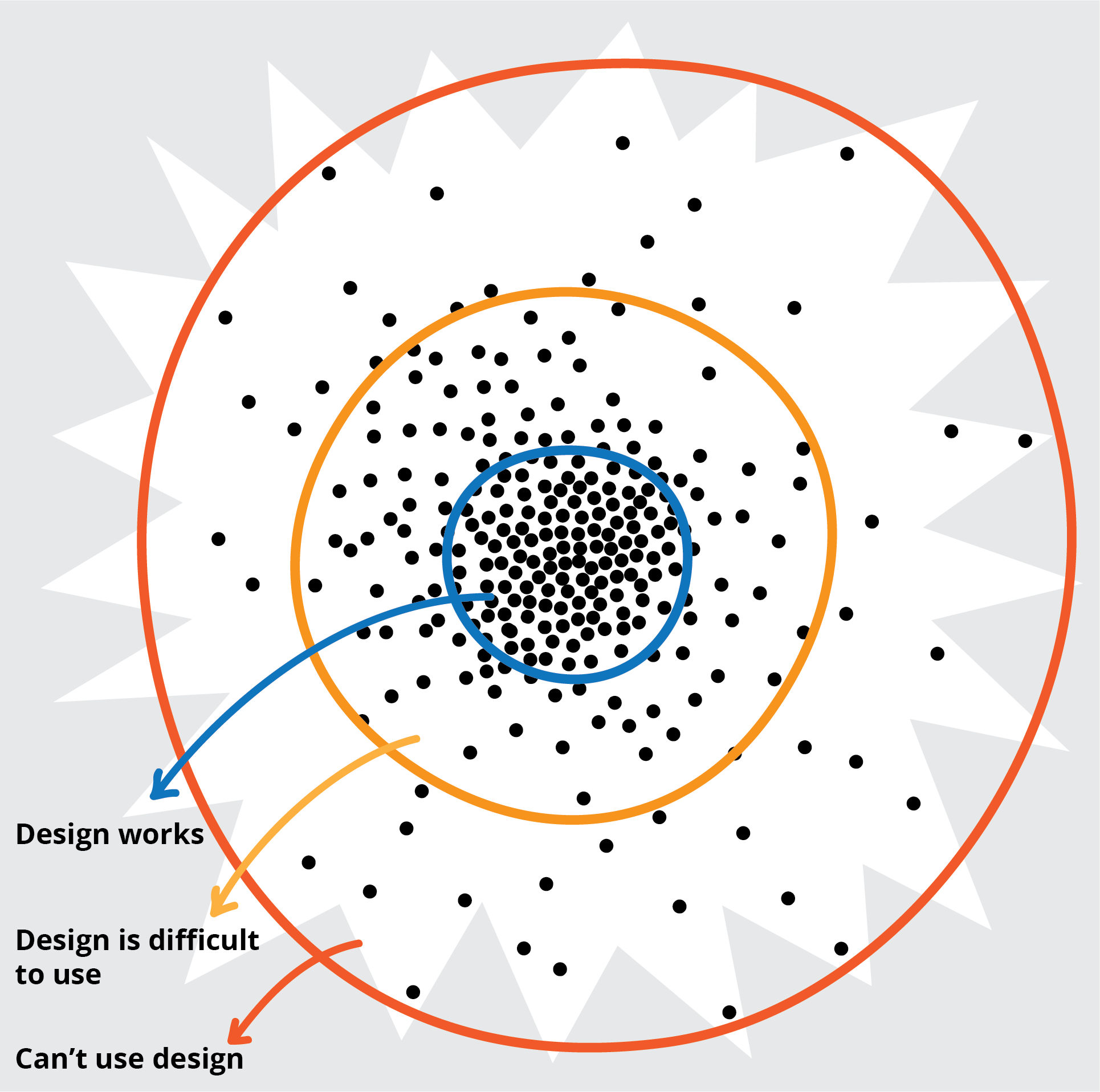
Figure 4: The scatterplot showing people who have difficulty using the design and people that can’t use the design, out at the periphery.
The scatterplot showing people who have difficulty using the design and people that can’t use the design, out at the periphery.
In inclusive design we recommend inviting people that can’t use or have difficulty using your current design to help you redesign. Companies that hope to create more useful machine intelligence are also beginning to realize the advantages of machine intelligence that recognizes and understands the full range of diversity and not just the dominant patterns.
Humans and Categories
I want to add a proviso or qualifier. One thing we also need to unlearn is our unconscious reliance on a deeply ingrained human competency. It is a human competency that has figured in the debate about what distinguishes human intelligence from machine intelligence. A problem that stumped artificial intelligence machines but that is easy for most two-year-olds is to classify or sort things like cats from dogs (try articulating rules you would use to tell a cat from a dog). Search for the meme “dogs or muffins” and you will see further examples. Our sorting and classifying abilities are stellar and ingrained. We also love opposites, binaries or polarities. You may have fond memories of kindergarten exercises and Sesame Street songs that ask you to identify opposites. It is no wonder that we apply these skills so unconsciously and ubiquitously. However, issues arise when we impose this categorization on people. People are complex, multi-dimensional and evolving. Trying to fit people into classificatory boxes is very problematic.
A common practice when trying to achieve a more inclusive design is to rely on categories of people to achieve representation. The simplest variant is to create binaries: able-bodied and disabled, male and female, for example. More sophisticated variants are to include representation from a list of human categories: people who are blind, Deaf, wheelchair users; or a colour wheel of racial origin. What is wrong with this as a way of achieving better representation? People are complex, variable and multi-dimensional. The classifier used to sort the person may not be the most important characteristic that informs the perspective or needs they bring.
More importantly, if the goal is to cover the 80% of the design space needed to reach the peripheral 20%, creating categories is not going to work. People will fall through the cracks and will be stranded at the edges of our chosen categories. This will drive a wedge between people that are included and people that continue to be marginalized. Where does my gender fluid young niece fit in the categories of men and women? Where does my friend who has a rare progressive disability fit in the categories we have created to sort people who experience disabilities? The further out to the periphery you get the greater your difference.
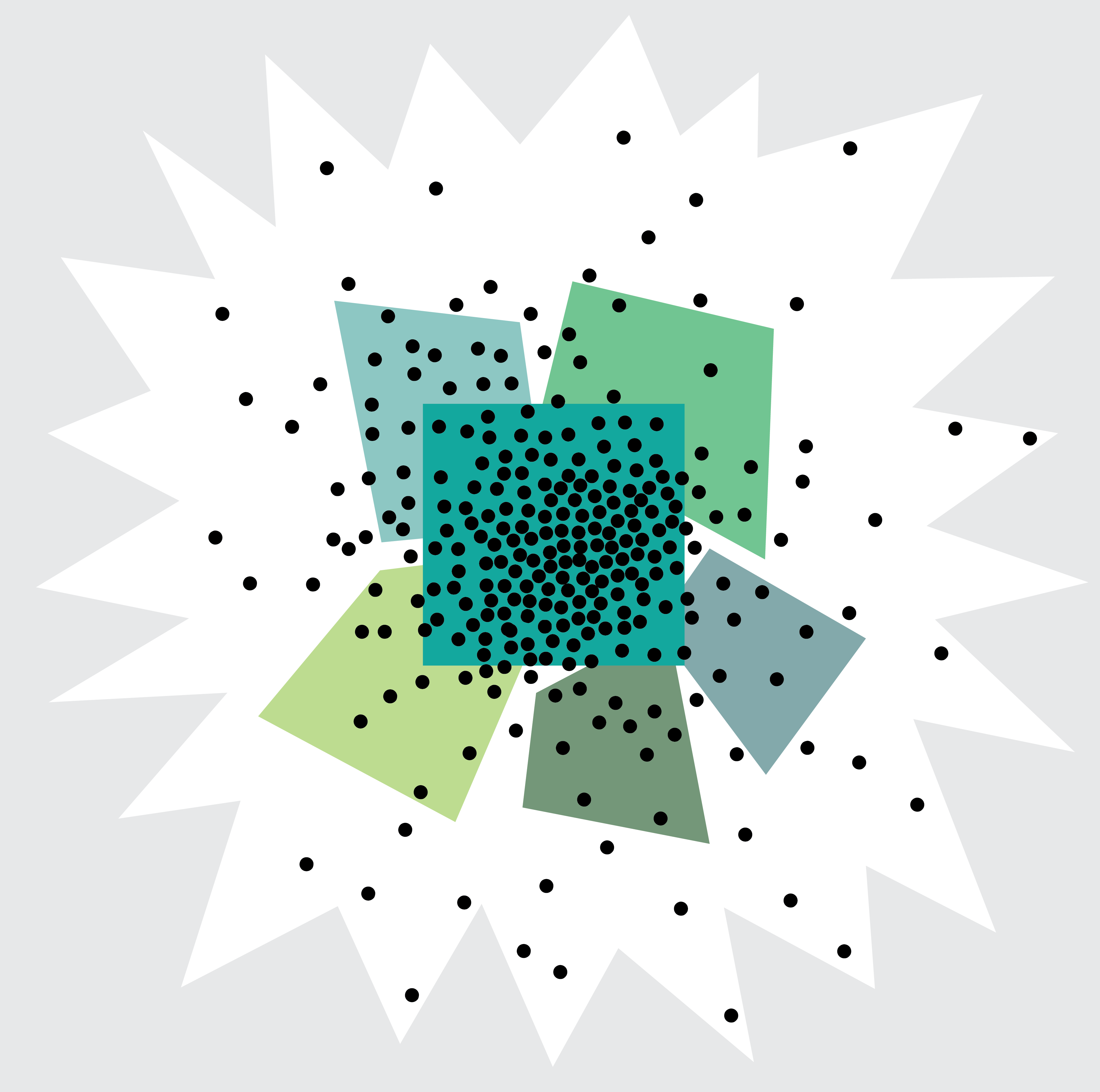
Figure 5: Scatterplot of needs showing how we capture categories of needs, but leave people at the edge and falling through the cracks.
The best approach is to continuously ask “who are we missing?” What perspectives are not at the table and how can we design the table so that they can participate in our process? This is best achieved through iterative, rapid, full-cycles of design, development, implementation and evaluation; by growing from small successes that invite participation and constructive critique. This provides an opportunity at each iteration to thoughtfully reflect on who is missing.
It is adding these missing perspectives that will bring about change, innovation, and dynamic resilience. The further participants are from the well-served middle, the better. The more dimensions or aspects of the periphery we can include, the better. The magic factor that makes the whole far greater than the parts is the range of difference. This will not only stretch what we produce, but it will stretch our process so that we can tackle the unpredictable complexity ahead.
With the help of “Strangers”
The late and wise Ontarian, Ursula Franklin, referred to this phenomenon as the “gift of strangers.” She felt it was imperative that we continuously extend our world with the help of strangers. It is not a skill that comes easily or unconsciously, it takes effort. Luckily humans can draw upon a struggling urge to grow and improve. Our Ontario community is primed to harness this gift of strangers. Hillary and her team are well on their way to addressing the complex challenge.