Accessible Modal Dialogs
What are Modal Dialogs
A modal dialog is an interaction where the user is forced to take an action required before proceeding to another activity. Typically modal dialogs are visually displayed as a child window which interrupts the user’s workflow until it is addressed.
Typically these are windows or “pop-ups” which block any further interaction until a control (like an “OK” button) is selected.

Figure 1: A modal dialog is a child window that blocks all interaction with other content until the dialog is dismissed. Source: http://www.shop.ca/
Why Should You Care?
Modal interactions, such as modal dialogs, should be used cautiously because they create a cognitive burden by:
- causing the opposite result since dialogs are often dismissed without consideration 1,
- interrupting workflow and making the task longer to complete 2, and
- increasing error rate by distracting the user 3.
The way a dialog is implemented can also cause problems by:
- being positioned to obscure content, or placed off-screen where it can’t be fully seen,
- requiring careful focus management,
- creating undesired results when the browser’s Back button is used (i.e. does the back button reverse the dialog, or does it go backward in browser history?), and
- having poor accessibility and support for assistive technologies.
Why are Modal Interactions Typically Inaccessible?
Modal interactions are often considered inaccessible. The most common issues are:
- Poor communication of intention (semantics) for assistive technologies - is it a dialog or just another paragraph?
- Improper handling of focus control, allowing the user is able to access content intended to be blocked.
- Dialogs are not announced to assistive technologies.
- Unclear indication which content is blocked from interaction.
- Insufficient contrast between the dialog container and the outlying content - a faded background or alpha channel blending may not be sufficient contrast (Reference WCAG 2.0 Contrast).
Some of these accessibility issues can be overcome through proper implementation which will be discussed later in this article.
Using Modal Containers
A popular use of a modal interaction is to use a modal container which focuses the user to a particular interaction path while maintaining their context. For example, an image gallery lightbox is a popular implementation of such an interaction.

Figure 2: Screen capture of a lightbox dialog displaying a larger image amoung smaller thumbnails of images. Source: http://fancybox.net/
Like modal dialogs, modal containers should be used cautiously because of the accessibility issues they may cause (see Why are Modal Interactions Typically Inaccessible?).
Generally speaking, if a lot of content or interaction is being done through a modal interaction, consider implementing the interaction outside of a modal and on its own web page. This helps make it clear to all users what the interaction should be - a modal interface should not be a substitute for content that is better suited for separate web page.
Decision Table for Using Modal Interactions and Alternatives
The following table can help you decide when to use a modal interaction.
| Forced Interaction | Interaction Complexity | Number of Choices | Solution |
|---|---|---|---|
| No | Simple | 2+ | Menu, expanding container, accordion, drawer |
| Yes | Complex | 2+ | Separate web page |
| Yes | Simple | 1 | Alert box |
| Yes | Simple | 2 to 3 | Modal dialog |
If it is not necessary to force the user along an interaction path, then consider using a collapsing menu, or an expandable container like an accordion or drawer.
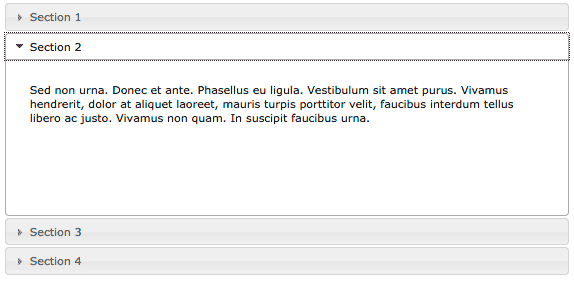
Figure 3: An accordion panel allows content to be visually hidden and shown on-demand. Source: https://jqueryui.com/accordion/
If it is necessary to force the user along an interaction path, and the message is not simple or contains a lot of choices or interaction, then consider using a separate web page.
If the purpose of the modal is to deliver an important message to the user, then consider using an alert box.
If it is necessary to force the user along an interaction path, and the message is simple and has a small number of clearly marked choices, then consider using a modal dialog.
Suggested Acceptable Use of Modal Dialogs
Given the issues outlined above, when is it appropriate to use a modal dialog? Since dialogs are often ignored and dismissed without consideration (which can cause undesired results), and disrupt the user (that lead to other problems), dialogs are ideally used for short succinct interactions where it is desirable to not take the user out of their context.
Examples of appropriate use of dialogs:
- User attempts to navigate away from a page where they have entered information.
- An action has been chosen which deletes information.
- A system error or event which has resulted in data loss.
- Creating a user account or user login.
Any other use of a modal-like interaction should be done carefully.
Tips for Successful Modal Dialogs
If the purpose of a dialog is to force the user to take immediate action - success is achieved when the user understands the message and their choice causes expected results. Effort should be made to make this interaction as quick and simple as possible to reduce the possibility of errors improve user experience.
- Choices should be clearly indicated with labels that communicate the outcome.
- Short messages increases the likelihood it will be read and understood.
- Limit the number of choices and interactive components.
- Avoid complicated or wordy jargon.
- Use controls appropriate for the interaction - i.e. don’t have a “Cancel” or “Close” option if the purpose is to have the user make an affirmative choice.
- Avoid using labels which are not appropriate or assumes a user’s state. For example labels like “Okay”, “I got it”, “Get me out of here” may not be appropriate or understood - keep labels simple and to-the-point.
- Clearly indicate focus with sufficient contrast and style.
- Avoid using words like “Click” or “Press” when giving instructions.
Accessibility Guidelines for Implementing Modal Dialogs
To improve the semantics and accessibility of modal dialogs, the following HTML and ARIA markup is recommended.
HTML Structure for Modal Dialogs
<article>: Contain the dialog within an<article>element to help distinguish the dialog from other content in the<h1>: The header describing the dialog. Including this header is an important landmark for assistive technologies.<p>,<div>, or<span>: The content of the dialog.<input type="button">: The choices used to dismiss the dialog should be buttons.
ARIA for Modal Dialogs
aria-hidden: set totruewhen the dialog is not perceivable, set tofalsewhen the dialog is perceivable.aria-labelledby: the<article>container should be labelled by the<header>element.aria-describedby: the<article>container should be described by the contents of the dialog.role="dialog"orrole="alertdialog": the<article>container role should have either one of these roles.alertdialogis a special case where the outcome may cause a problem or data loss. For example, the user has attempted to delete an email message.dialogis used for other cases like when the user is inputing information, or making a choice that can be reverted.
Managing Focus
To restrict focus to just the modal dialog, you will need to use Javascript to put focus on the dialog container (i.e. the <article> element) and then force focus back onto the dialog if the focus leaves.
The article “Making an accessible dialog box” by Nicholas C. Zakas outlines the Javascript required to manage the dialog interaction correctly.
Modal Dialog Markup Example
<article role="dialog" aria-labelledby="dialogTitle" aria-describedby="dialogContents" aria-hidden="false">
    <h1 id="dialogTitle">Send email without a subject?</h1>
    <p id="dialogContents">Are you sure you want to send the email without a subject?</p>
    <input type="button" value="No">
    <input type="button" value="Yes">
</article>
Modal Forms
Sometimes it is desirable to put a form within a modal dialog like a login prompt, or filling out a contact information form.
In such situations keep the interaction simple, and only use a small number of input fields (4 fields maximum).
Implementation Resources
- Using the dialog role, Mozilla Devloper Network.
- Making Modal Windows Better for Everyone, Smashing Magazine 2014.
- Advanced Aria Tip 2 Accessible Modal Dialogs, Marco’s Accessibility Blog 2015.
- jQuery UI Modal Dialog, jQuery UI.
Implementation Alternatives
- jQuery UI Accordion, jQuery.
- Alert role example using an ARIA alert box, Open Ajax Alliance.
- Tab Panel: Accordian, Open Ajax Alliance.
- Hide/Show Region, Open Ajax Alliance.
Footnotes:
- R. Bohme and S. Kopsell. Trained to accept? A field experiment on consent dialogs. CHI, 2010.
- Kristen H. Goodell, Caroline G.L. Cao, and Steven D. Schwaitzberg. Effects of Cognitive Distraction on Performance of Laparoscopic Surgical Tasks. Journal of Laparoendoscopic & Advanced Surgical Techniques. April 2006, 16(2): 94-98. doi:10.1089/lap.2006.16.94.
- Elizabeth Flynn. Impact of interruptions and distractions on dispensing errors in an ambulatory care pharmacy.. American Journal of Health-System Pharmacy. 1999 Jul 1;56(13):1319-25.